Colour psychology can have a large impact on the space and mood in your home, but it can be overwhelming figuring out where to start.
Google search data shows searches for ‘Paint colour ideas’ have increased by over 3,000% from this time last year to over 12,000 monthly searches.
Luckily, Chris Morgan from Ronseal has shared a comprehensive guide to the best colours to paint each room in the home according to colour psychology.
This comes as Ronseal recently launched a new interior paint range, One Coat Everywhere. The new paint range is available in 21 different colours and can easily be applied without a primer on almost any interior surface including walls, ceilings, wood, and metal to give that seamless appearance.
Three important things to consider when choosing a paint colour:
According to Chris, there are three things homeowners should consider before choosing a paint colour.
- Think about the atmosphere – Different interior paint colours evoke different emotions and so you need to think about what that space will be used for. Are you looking to entertain and host? Or do you want to sit down and relax.
- How light is the room – Daylight can dramatically impact the overall appearance and atmosphere of a room’s environment. Typically, if your room is facing north/south the sun will not shine directly into the space, unlike east/west facing rooms.
- Are you trend or taste-led – Do you actually like the colour, or are you simply going along with everybody else? Especially when it comes to greige (grey and beige) interiors often people are influenced by other people’s tastes or perceptions.
Brits favourite home colour schemes
A survey of 500 homeowners, conducted by Ronseal, found that the majority (56%) chose neutral colours such as whites, greys, and beiges to paint their home interiors.
Bold colours such as reds, greens, and yellows alongside earthy colours like browns, beiges, and greens then followed, both with 14% choosing these.
Pastel colours like pinks, yellows, and blues then closely followed with 11% choosing these whilst only 5% chose dark colours including blacks and dark greys.
The best paint colours for each room according to colour psychology:
The bedroom
Dark: Blue or grey
Light: Green or beige
“You want your bedroom to be a calming and comforting place away from the hustle and bustle of everyday life. It is the room of sleep and so you want colours that help to relax and calm you.
“Deep blues and greys can provide a sense of cosiness and snugness whilst also helping to keep the space sophisticated.
“Paler tones like greens and beige can bring a sense of calmness and open out the room to make it appear more spacious.”
The living room
Dark: Blue or green
Light: Beige or off-white
“The living room is the centre stage in a home where you are likely to spend the majority of your time awake. Because it can be used in many different ways by different people, it is best to keep the colours relatively neutral.
“Beige and off-white tones help to lighten the room and give it a cosy and safe feeling. They are fantastic in multi-purpose rooms as accessories can be added to introduce pops of colour.
“Bolder choices like blue and green tones can also create a relaxing and calming environment and provide a nod to the natural world.”
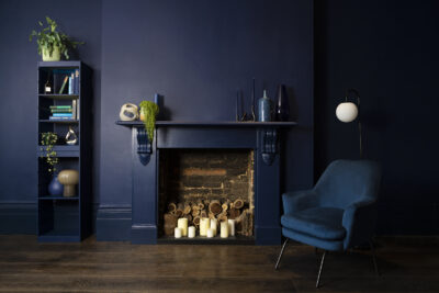
The home office
Dark: Blue or grey
Light: Yellow or coral
“In home office environments you don’t want the colours to be distracting. Blue tones can help with focus as well as create a calming, tranquil environment, perfect for any workspace.
“Brighter tones like coral and yellows are also great choices thanks to their stress-reducing properties.”
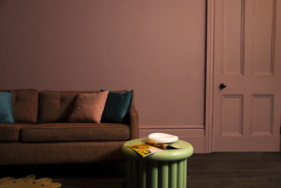
The kitchen
Dark: Yellow or red
Light: White or grey
“The kitchen is another key area for activity in the home, so you want to choose colours that inspire creativity and energy. Warm yellow and red tones are associated with happiness and energy perfect for sparking conversation and excitement.
“More neutral tones like white and grey are a timeless choice that can create a sleek, modern appearance of a clean space. They can also be easily dressed up with accents of bolder colours.”
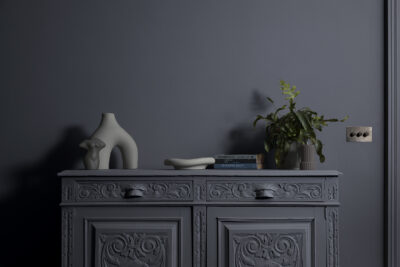
The bathroom
Dark: Turquoise or blue
Light: Grey or white
“Turquoise and teal are excellent tones to use in a bathroom environment as they help to create a spa-like sanctuary for relaxation. These can pair in contrast with white tiles to help create a vivid, modern space.
“Rich blues and greens also lend themselves brilliantly to bathrooms as they too can help with relaxation and switching off. These tones are especially great for bathroom panelling.
“Greys and whites can also help to create a clean, clutter-free space that is open and inviting. Brightly coloured towels and bathmats can be paired to give the space some energy and freshness.”
For more information and inspiration, head over to the Ronseal website:https://www.ronseal.com/inspiration/
